Everything that surrounds a person, one way or another, influences him, and the color of the environment is no exception. Different color palettes can have different effects on mental state, vital energy, and creativity.
To a certain extent, the color schemes of the interior of a living space can influence the relationships between family members. There are certain patterns between combinations of color shades that should be taken into account in order to create an environment in the house that has a beneficial effect on those living in it.
Combination of warm and cool colors
Among designers, there is a classic scheme of color division into a group of warm colors:
- Red.
- Orange.
- Yellow.
And for the group of cool colors:
- Green.
- Blue.
- Blue.
- Violet.
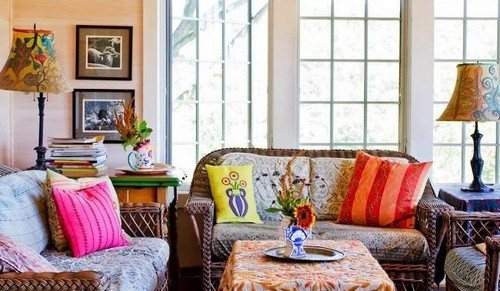
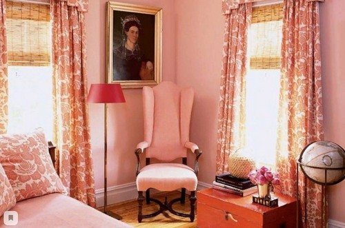
The interiors attract attention with their beauty, where against a general background consisting of bright fiery colors of yellow, terracotta, orange, red tones, there are design elements made in cool color combinations.
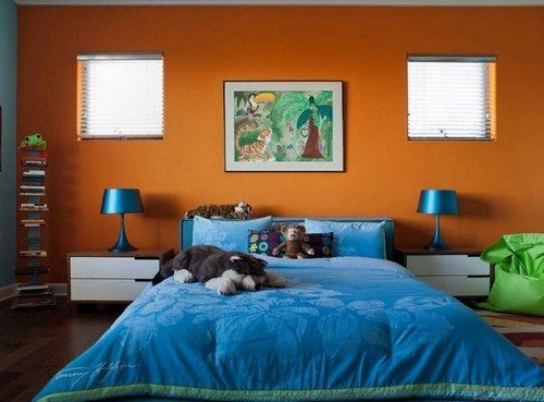
The look is ideal, since, on the one hand, cold tones will emphasize the warm atmosphere, and on the other hand, cool it somewhat so that there is no overabundance of the overall bright background.
Bringing in additional tones
As you know, when two primary colors (for example, yellow and blue) are mixed, a new one (green) is obtained.With different proportions of mixed paints, a variety of additional shades are obtained.
To add more vitality to the color palette of your surroundings, it is recommended to introduce a halftone obtained by mixing the primary tones present. This principle can be used when decorating playrooms, living rooms and dining rooms.
But such a solution is unlikely to be suitable for bedrooms, since this is a place of rest and peace. The following option would be more appropriate.
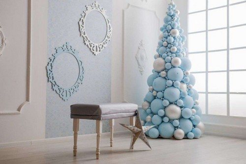
Combination of similar colors
The most suitable palette for arranging lounges, bedrooms, and libraries. Thanks to this combination, the atmosphere of the room acquires a measured, calming background. For example, in rooms with a basic peach color, berry-colored curtains may fit well. In this case, the overall harmony of color will not be disrupted.
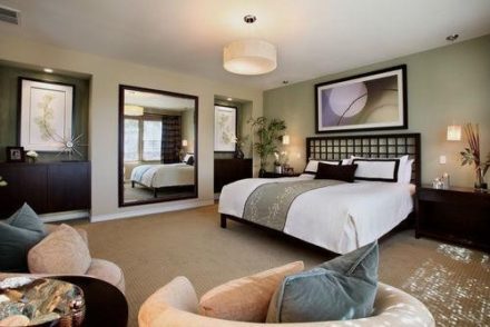
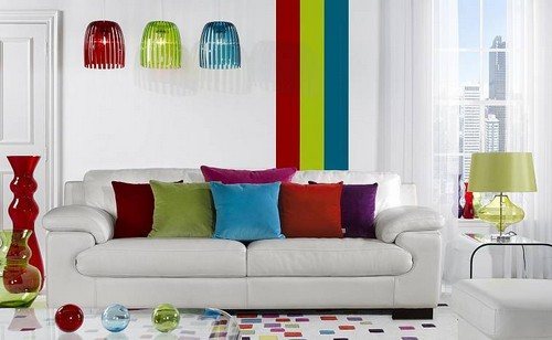
Neutral background with a splash of color
Still, most people prefer monochromatic interiors made of neutral shades. Any bright, rich paint will suit these colors as an accent. This design style is typical for lovers of hi-tech and minimalism.
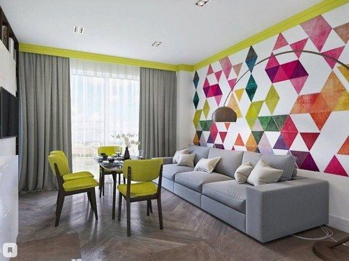
If you periodically change the palette of bright colors, then the atmosphere of the room will change accordingly. Moreover, a minimal amount of effort will be expended. It is possible to use several colors at the same time. It is only important that they match each other in tone and saturation.
The ability to use color accents in the design of a living space helps create an atmosphere of comfort, well-being and beauty. The main thing is not to be afraid to experiment and be creative.